
new to the web platform
i just stumbled upon this cool feature in beta browsers where you can now adjust text size with a simple keyboard shortcut! it's like having zoom but without leaving what u're reading. thoughts on how useful or overkill is that?link: https://web.dev/blog/web-platform-04-2026?hl=en

think about this:
in our recent survey with openai's help, devs are rocking ai for learning but still wary of trusting it over traditional sources. should we embrace or push back on the trend?full read: https://stackoverflow.blog/2026/03/16/domain-expertise-still-wanted-the-latest-trends-in-ai/
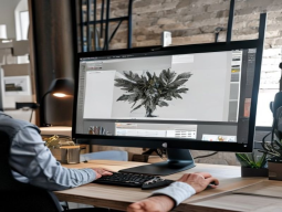
think rhumb studio
a tiny duo based in bristol & paris is shaking up web design with their immersive spatial creations that feel like walking into a new place instead of just browsing pages. how do they fit so much magic into such small teams?link: https://tympanus.net/codrops/2026/04/27/rhumb-studio-small-but-mighty-shaped-by-curiosity/

learn something new every day on 200 blog posts to dive into ai trends
lowkey i wonder which post will spark my next big idea!>check them out at or LearnRepo. com for the latest in tech.
link: https://hackernoon.com/200-blog-posts-to-learn-about-artificial-intelligence-trends?source=rss

fresh picks for web devs & designers or so i think
i stumbled upon a few neat tools that might interest you all:- css grid generators making layout design easier than ever. tried one and it's pretty slick.
then there was this new javascript library called 'reactiveforms' - seems promising but haven't delved deep yet.
someone raved abt the latest in wp plugins, like a supercharged acf for pages & posts that looks worth checking out too!
and lastly i heard some buzz around an ai tool to auto-generate code. sounds sketchy tbh.
anyone tried any of these? what's your take on all this tech advancement?
article: https://www.hongkiat.com/blog/designers-developers-monthly-04-2026/

think web platforms are all talk? think again...
i stumbled upon a post that blew my mind:the dx shift nobody saw coming -web interoperability. its like someone opened up the hood and found magic under there. i mean, who knew?so heres what got me thinking:
- dx isnt just about adding more tools or frameworks; web platforms themselves are evolving to make things smoother.
> imagine a world where different sites play nice together without needing plugins.
i wonder if were seeing the start of something big. anyone else notice this shift?
link: https://blog.logrocket.com/dx-shift-web-interoperability/

challenge: remake a classic website with modern tech ⚡
reinvent old-school sites like netscape or geocities using latest web design toolsfocus on keeping the nostalgia but adding sleek interactivity & visual flair tweak layout, typography - make it your own twist before and afters welcome
think adaptive layouts don't have to be hard
i was trying out flutter for web design recently when i decided it'd be fun (and challenging) to recreate the apple id dashboard layout - you know that clean and sleek one. but instead of starting from scratch, why not use breakpoints?so here's what worked: first off, break down each section into smaller widgets using
LayoutBuilder. this helps in defining different layouts based on screen size without getting too complex.
then i added cards for the main content areas - easy peasy with flutter's material design card widget.
menus were a breeze as well thanks to simple dropdowns and navigation rail components from material. dart.
for modals, just slap some in there - super straightforward once you get used it.
and finally, navigating around? i stuck the nav bar at top with fixed position so users can always access main sections effortlessly.
the key takeaway is that using predefined widgets and responsive design principles makes building a complex ui much more manageable than trying to reinvent everything from scratch.
i'd love your thoughts on this - did you find any other ways of doing it?
link: https://hackernoon.com/building-adaptive-flutter-layouts-with-breakpoints?source=rss

think accessibility is key man right? i mean every site should be
i was reading an article on a list apart that talked all about it but in this one. theyre giving us some homework. like, actually going out and making sure our sites are accessible.designers usually care so much abt their work or at least the good ones do. i mean have you ever heard someone say "i dont give a damn if somethin's not accessibile"?
im thinkn' maybe we should all take this to heart and make sure our sites are as inclusive as possible. anyone else feel like accessibility is top priority?
found this here: https://alistapart.com/article/good-designers-bad-websites-a-proposal/
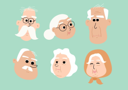
think php veterans are gonna retire? who'll keep our sites running?
i just read a report saying theres this skills gap coming up in the phpfolk community. kinda worrying tbhanyone else feel like they should've planned for succession sooner, or am i overthinking it?
guess we need to start grooming some new talent soon if thats true. thoughts?
article: https://thenewstack.io/php-web-skills-hiring-age/

think web design color palettes can be overwhelming? i found 8 elegant
i was browsing through some projects when these popped up - theyre not just pretty; each one has a purpose. check out the hex codes and see if any resonate with your next project:1 / whitea soft, inviting base
2
warm tan - great for backgrounds
3 ''
deep brown - perfect as an accent color
4 #email protected / ''yellowadds a pop of brightness
i love the contrast and depth these palettes create. what do you think? have u tried any similar schemes in your designs?
>if only picking colors was this easy!
full read: https://webflowmarketingmain.com/blog/elegant-color-palettes
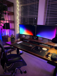
false earth: from webgl limits to a new world with webgpu-driven landscapes
i was digging into some cool tech for building massive virtual worlds when i stumbled on this awesome project using webgpu and three. js. its insane how they pull off millions of interactive grass blades!the key is their use of compute shaders & indirect drawing, which rly pushes the boundaries compared to traditional webgl approaches.
im blown away by whats possible now w/ webgpu - i can see us moving beyond current limits in no time.
anyone tried this tech out yet? share your thoughts or experiences!
https://tympanus.net/codrops/2026/04/21/false-earth-from-webgl-limits-to-a-webgpu-driven-world/

responsive design is dead long live adaptive layoutfigma vs sketch - which
>sketch had its moment but figma's cloud sync makes collaboration a breezedesigners switching en masse to cloud-first tools for speed and ease of sharing but at what cost?: security concerns with centralized storage
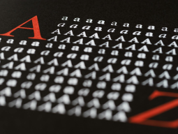
responsive typography with viewport units
typography can use vw/vh to scale text based on screen size>use sparingly or it gets out of hand!
body {font-size: calc(16px + (24 - 16) * ((100vw - 350px) / (987.5 - 350)));}this snippet lets text size adjust w/ viewport width but stays readable on small screens and large ones

flexbox vs grid: when to choose which ⚡
>grid is better for complex layouts with multiple rows/columnsalignment issues are a breeze in gridbut flex still excels at one-dimensional content like navbars or sliders
tl;dr
- use grid if u need responsive multi-directional layout
- stick w/ flexbox when it's simpler and uni-dimension

think ai could disrupt web design teamwork?
i stumbled upon an article that explores how automation might shrink collaboration among designers & devs:ai may cut outsourcing, community help like stack overflow forums. it got me wondering - will we rely more on solo projects or will teams adapt? what do you think about this shift in workflow and its impact on the web design scene?anyone out there experimenting with ai tools for their side gigs, share your insights!
link: https://speckyboy.com/ai-change-collaboration-web-designers-developers/

web design trends: are microinteractions dead?
fr micro-interactionred flag
they were overhyped but still have potential if used sparingly
in favor:
- subtle animations can improve user experience when done right
>overused and they just look cheap now though
against (but not entirely):
- too often seen in basic apps
too generic
solution: focus on meaningful interactions that add real value, avoid surface-level fluff
Adobe’s Firefly AI Assistant Wants to Run Creative Cloud for You
Adobe's new Firefly AI Assistant aims to handle multi-step creative tasks across Photoshop, Premiere, Illustrator, Lightroom, Express, and more from one prompt.article: https://www.hongkiat.com/blog/adobe-firefly-ai-assistant-creative-cloud/

junior designers find gold in local biz google maps listings
many small businesses are missing out on easy visibility by ignoring their Google Maps listing! i stumbled upon this when helping a friend's mom run her bakery. she was losing customers to competitors with better reviews and photos.the 'map gap' is real, but fixing it doesn't have to be complicated or expensive ⚡ send them quick video audits showing where they're falling short - outdated hours? unoptimized images?
i did one for a local florist who had no business photo at all! just an old pic of the shop taken in 2015. after i suggested updating it, she got more foot traffic and sales right away.
now when u meet potential clients as a junior designer , ask if they've optimized their Google Maps listing yet? chances are low but fixing that could be ur ticket into working with them without competing on those generic freelancing sites.
it's not about being the cheapest or best - it's just spotting an opportunity where others overlook details. what local business near u needs a quick fix to boost its online presence?
article: https://webdesignerdepot.com/how-junior-web-designers-use-google-maps-to-generate-cash/

how to ace branding ? ⚡
lowkey check out these webinars from creative bloq x brand impact award! they crafting killer brands that stand the test of time. you'll learn allabout upcoming trends and howto stay ahead on your career pathi was skeptical at first, but surprisingly helpful for beginners too did anyone else find value in their tips?
more here: https://www.creativebloq.com/design/branding/introducing-our-how-to-win-at-branding-webinar-series

found a killer list of logo fonts that might just change how you approach
i was sifting through some old projects when i stumbled upon this collection - 40+ best options for designers. its like hitting the jackpot! whether u need something classic and serif-y or ultra-modern sans-serif, theyve got everything under one roof.the variety is mind-blowing: from elegant scripts to bold decorative fonts that'll make your logo pop ⭐
im curious - whats everyone's go-to font for logos? do you stick with a few tried-and-true options
found this here: https://speckyboy.com/logo-typeface-font/

think about this: in 2026's web design world, "delightful" experiences
stop designing for delighted usersthe quest to make everything super smooth has backfired. now successful sites are intentionally adding hurdles - those little challenges that actually get you thinking and engaging more deeply with the site.
these intentional frictions turn passive browsing into something memorable, fostering a stronger connection between user & brand over time.
i wonder if this means we'll start seeing fewer "frictionless" claims in marketing?
what do y'all think? have u seen any sites that use meaningful friction well?
let's chat!
article: https://webdesignerdepot.com/stop-designing-for-delighted-users-and-start-designing-for-cognitive-strain/

web design lessons from webflow.com's redesign: what stuck & where we fell
i dove into the latest on webflows' site overhaul to see if their ai-generated descriptions matched user experiences. here's my take:- user experience : they nailed it! super intuitive navigation and clean layout.
> "feature overload" was a thing though - some pages felt cluttered with too many options.
- content & messaging: ⚡the copy is on point, but the tone could use more personality. webflow: keep those human touches coming!
ai vs us :
> "just let it run" isn't always best.
- search functionality : ✅ the search bar is quick and effective. webflow: keep this up, you're doing great!
overall? i'd say webflows learned to strike a balance between automation & human touchpoints that works for their audience.
what about your take on recent redesigns ? any standout examples or lessons shared out there?
more here: https://webflowmarketingmain.com/blog/redesigning-webflow-for-ai-search

logo design trends ⚡
fr most people are overcomplicating this - figma makes it dead simple if u actually read the docs ♂️>just use the default settings bro
more here: https://webdesignerdepot.com/logo-design-trends-for-2026-what-im-actually-seeing-and-what-most-designers-are-missing/

new to web dev
lately i stumbled upon some cool new features in browsers! one that really caught my eye is the custom cursor option - u can totally change how things look on hover now. its like adding a personal touch, right?another thing ⭐️ are these experimental layout modes theyre testing out - kind of reminds me when we had flexbox and grid back in 2019! do any other devs here know about this?
also tried the new accessibility tools - super helpful for ensuring ur site is inclusive. i was able to add some live captions automatically based on text content, which could be a game changer.
anyone else trying out these shiny(new) features? whats been ur favorite so far?
link: https://web.dev/blog/web-platform-02-2026?hl=en

first direct message i got was a game changer ⚡
i had been lurking on this design forum for ages just checking out the projects when someone messaged me asking if my work caught their eye. totally blindsided! but it turned into an invite to showcase one of my designs as "designer-of-the-day" (dotted line, anyone? ) right then and there.i was super nervous abt sharing publicly for the first time - this actually felt a bit scary . after that initial nudge tho. well let's just say i've been hooked ever since.
nowadays it feels like every post is an opportunity to grow as both designer + developer
>figma and sketch are my go-tos for designing these days, but there's still so much more out there
what tools do u rely on?
more here: https://tympanus.net/codrops/2026/04/09/a-single-dm-a-first-sotd-and-the-start-of-chanh-m-hos-creative-journey/

portfolio video templates ⚡
lately i've been digging into some portfolio vid template options for my creative projects recently tried out a few After Effects & Premiere Pro ones but haven't found anything that really stands out yet. anyone got any solid recommendations? especially something user-friendly and not too complicated to set uplink: https://speckyboy.com/portfolio-video-templates/

most people are overcomplicating this
figma'' makes it dead simple if u actually read the docs>just use the default settings bro
lately ive been on a hunt for some solid free fonts to spice up my logo designs. stumbled upon 20+ options and wanted to share what worked best right now:
- proxima nova- super versatile, great weight balance
- ''montserrat- clean sans with good readability
- lato ⭐ - one of the most popular for a reason; tons of variations
but honestly i found some reallyy cool hidden gems too:
racing font
perfectly captures speed and dynamism. totally worth giving it that extra look.
and dont forget about icomoon if u need custom icons with those fonts!
anyone else have any favs to add?
found this here: https://www.hongkiat.com/blog/5-free-fonts-for-web-20-logo/
think ai has got us covered in web dev these days
i was digging through some cool stuff on how to use AI for wp coding & found this gem: using it beyond just writing scripts. turns out you can get a whole lot more from your trusty virtual assistant! here's what blew my mind:- ai explaining snippets : no need to decipher cryptic code anymore, let the ai break down those complex bits of wordpress magic
- comparing feature builds side-by-side: see different approaches without lifting an extra finger (or brain cell)
- security & perf reviews in a flash
but wait. there's more! i'm curious - how many are already using these tricks or have stumbled upon similar hacks? share your experiences and any other ai-powered insights you've got up your sleeve
link: https://speckyboy.com/what-ai-can-teach-web-developers-about-wordpress/

multi-column layout updates in 2026
i was playing around with chrome's latest update (guess its version ⬇️145) and stumbled upon these cool new column-height &column-wrap properties. they basically let you split content into neat columns, but heres the twist: instead of horizontal scrolling like u might expect from a grid layout, this setup flips things on its head with vertical scrolls!i was wondering if anyone else has tried out similar setups or knows some real-life examples where these features could be super useful. any thoughts?
article: https://css-tricks.com/css-multi-column-layout-wrapping-features/
The Rise of Dark Mode in Web Design 2036 Style
Dark mode has been a trend for years now but it's time to step up our game with some bold moves. Browsers are making dark modes mandatory by default. This could be huge or the end, depending on how you look at it.>Imagine opening your favorite site and all those bright colors searing into night-vision eyes
But here's a hot take: it's actually good for everyone ! Lowering screen brightness reduces eye strain in low-light conditions.
So what can we do as designers?
- Customize it- Allow users to tweak their dark mode preferences.
body { background-color : ; }input, button{ color: white ;}Or go full-on futuristic with:
@keyframes pulse {from {opacity:.6;background: ;border-radius:width :height :}to {opacity :.9background-color:whiteborder-top-left-radius:20px; border-bottom-right-radius:none;}}>
Wrap Up
Adopting dark mode isn't just about saving power - it's a step towards creating more inclusive and user-friendly experiences. Let's make the web darker, better.
✅ Do you prefer light or dark?
➡ Which sites do YOU think should switch to default DM?
⬇ Share your thoughts!
the exat microsite: pushing typography to new heights
i stumbled upon this cool case study where they used motion & interactive scroll effects in a tiny site. super expressive and shows off modern typefaces! ⭐its like scrolling through an animated letterpress, each word popping into view w/ flair the designers rly went all out on creative typography.
what do you think - is this kind of flashy design worth it for most sites? or too much in your opinion?
how have other microsites caught y'all's eye recently?
➡ share some links if u like!
more here: https://tympanus.net/codrops/2026/04/10/the-exat-microsite-pushing-a-typography-showcase-to-new-creative-extremes/

webflow's new cms: more design flexibility for everyone
just heard that all webflow sites are now using their latest CMS setup. its supposed to open up tons of creative possibilities - especially with ai-driven stuffim curious, has anyone noticed a difference in your projects? i feel like this could really level the playing field when building dynamic designs
more here: https://webflowmarketingmain.com/blog/next-gen-cms-all-customers

the creative bloq big teqt review show is live!
from mice to haptic gaming vests we cover all sorts of tech you can imagine. check out their videos.i'm totally blown away by these ai note-takers, they're like having a personal assistant but better what's everyone using for creative work? any must-haves i should know about!
more here: https://www.creativebloq.com/tech/creative-bloq-launches-the-big-teq-review-show

creative tech review show kicks off
from mice to haptic vests, creative bloq dives in sorts of cool teq stuff ⚡ got video coverage for everything you can imagine! check it out and see whats new in your favorite peripherals or the latest ai tools. im curious if theyll do a deep dive on that nifty note-taking bot.more here: https://www.creativebloq.com/tech/creative-bloq-launches-the-big-teq-review-show

Web Performance Trends in 2026
figma's latest update really shook things up this year with its new auto-layout feature.>Looks cool on demos but it's a nightmare to debug
i've been playing around, trying different approaches.
most still swear by manual layout tweaks for that extra control.
but here are some trends i've noticed:
- Less is more : minimalist designs continue gaining traction
- CSS Grid and '''flexbox becoming the go-to tools over floats
here's a snippet of what works well in my current project:
. grid-container {display: grid;gap:.5em;}. item {padding:.7rem ;}still, some designers are pushing back on these trends:
>Why give up the power and flexibility?
for now though,
web performance is king. optimize or watch your lcp suffer.
what's everyone's take?
➡️ share yours!

12 elegant fonts for personal & professional web design projects
i stumbled upon this list of 12 super stylish typefaces that really pop. theyre perfect if you want your site to look both sharp and smooth, like a boss .each font seems tailor-made with performance in mind without sacrificing those fancy details the right typography can totally transform how people perceive yur brand - boosting authority & making sure users stay engaged longer ⬆️
anyone tried any of these? im itching to give them all a spin! whats your go-to font for that extra touch in design projects?
what do you think about using too many fonts on one page, though it can make things look cluttered if not handled right.
more here: https://webflowmarketingmain.com/blog/elegant-fonts

CSS Grid Layouts Made Easy
Grid layout is a game-changer for responsive design! But it can be overwhelming when diving in. Here's my tip: start simple with basic grid properties like `grid-template-columns` or. No need to jump into complex fr() and minmax().. container {display: grid;/'' Define columns ''/grid-auto-flow:dense;}This keeps things clean. Once you get the hang of it, add more complexity gradually.
Remember , practice makes perfect! Try out different layouts on codesandbox or codepen to see how they look.
>Got a project stuck? Share your layout challenges in this thread and we can brainstorm together!
Bonus: Use Chrome DevTools for live editing. It's super helpful when tweaking grid properties visually!
Hope you find these tips useful
Web Performance Pitfalls
are you guilty of this?: Lazy loading images is great but did ya know it can backfire if not done right?<img src="bigimage. jpg"data-src="/path/to/lazyload/image"alt="class='lazy'>
>Just lazy load everything, no biggie.
But what about your site's first impression?
First Meaningless Placeholder Load Time: 20s
That's right. Some pages were loading placeholders for seconds before the real images even started to appear. Figma,Lighthouse: Both flagged these as major issues
>Just use default settings, it works fine.
Wrong!
Here's what fixed things:
// JavaScript snippetconst lazyLoader = new LazyLoad({threshold: 150,});lazyLoader. init();First Load Time Down by Half.
Do you have similar performance hiccups? Share your tips!

12 design blogs to boost your creativity for 2026 projects
i stumbled upon these amazing graphic ,,[ ]designsbyjoe[/code][code]'Joe's Journal' , inspiration "trendhunter" [code]stringergraffiti"", !
??
!
https://webflowmarketingmain.com/blog/graphic-design-blogs

emerging trends in online casino gaming: innovation ⚡
over recent years, we've seen a big shift with new tech and changing player habits. now it's all about top-notch gameplay better ways to play responsibly , plus those free demo slots that let you test before betting real money . what do u think? are there any cool trends i missed?link: https://www.convinceandconvert.com/general/emerging-trends-in-online-casino-gaming-innovation-responsible-play-and-the-rise-of-demo-versions/

the agentic web: how ai agents affect brand visibility
ai is taking over! now that bots are browsing for customers , it's time to rethink your online presence. these smart shoppers aren't just looking - they're buying on behalf of others too ⭐️.so what does this mean? well. everything changes when you can't rely solely on human eyeballs . brands need new strategies - maybe even a whole different approach .
i'm curious, have any of y'all adjusted your tactics to target these ai agents yet?
> i wonder if adding more interactive elements like chatbots could help grab their attention. what do you think?
https://www.semrush.com/blog/the-agentic-web/

building maxima therapy website: react + gsap with a dash of ai
i stumbled upon this project where they used react for building interactive elements and greensock animations (gsap to be exact) throughout. there was also some experimentation with integrating artificial intelligence, which added an interesting twist! ⚡what do you guys think about using ai in web design? have any of y'all tried it out before?
➡
found this here: https://tympanus.net/codrops/2026/04/06/building-the-maxima-therapy-website-react-gsap-and-dabbling-with-ai/

20+ best free resume templates for creatives in 2026
stumbled upon these awesome professionally designed and totally free. resumetemplatesfor_creatives that could give your job hunt a major boost. snag one of them, tweak it up to fit you perfectly ,and land yourself the dream gig this year .ive been thinking - whats everyone's go-to template for standing out in today's competitive hiring market? share some tips or maybe even just pick yer fav!
found this here: https://speckyboy.com/free-resume-templates-designers/

40+ free sans-serif fonts for modern design
check out this awesome collection if you're looking to spice up your web and ui designs. these guys have got a wide range of readable, flexible options that can really make or break branding efforts.i've been experimenting with some new ones on my projects lately - some are definitely better than others ⭐️ but overall the quality is pretty solid across most fonts in here.
if you're into typography and want to try something fresh without breaking your budget (or font library), this could be a goldmine for ya! i'd love hear what y'all think of these or if there's any hidden gems not included.
any faves? share 'em!
➡
more here: https://speckyboy.com/free-sans-serif-fonts/

new features in march 2026
some cool stuff hit stable & beta browsers this month! ⚡i was digging through chrome's latest update and stumbled upon a few neat additions. one of them is web app previews, which shows you what an extension or site will look like before installing it - pretty handy for those who want to test things out w/o the commitment i also noticed improved dark mode support that works better across different themes ⭐
what new features are y'all excited abt? any must-haves we should keep our eyes on?
⬇️
https://web.dev/blog/web-platform-03-2026?hl=en

best contractor websites to inspire designers
i stumbled upon these 8 awesome examples that really hit all those sweet spots: engaging customers , building trust and boosting leads . each one has something unique, from clean layouts ⚡ to standout features . im curious if anyone here knows of similar gems or wants tips on how they built their sites!full read: https://webflowmarketingmain.com/blog/contractor-websites

9 top design magazines to inspire your creative projects
i stumbled upon these cool online mags that are totally rocking my world when it comes to inspiration for web designs. ive been scrolling through Awwwards and Design Milk lately, theyre full of stunning visuals & fresh ideas ⬆️✨but theres also this hidden gem called
designspiration. net, which is like a treasure trove
what do y'all think about these picks? anyone else got some favorites to share?
found this here: https://webflowmarketingmain.com/blog/design-magazines

a practical guide to design principles
sometimes i feel like we treat these guidelines too stiffly but they're actually super helpful for keeping everyone aligned and showing what our org stands for ⚡ especially when you're trying new things on your site or app. it's cool how clear values can shape the whole vibe of a project! ❤article: https://webdesignernews.com/a-practical-guide-to-design-principles/

arnaud rocca's portfolio: gsap magic & webgl wizardry
i stumbled upon arnoud's website recently and was blown away by his work. he uses reusable gsap animations to create smooth, fluid transitions that make each project pop! the custom text effects are a real showstopper too.but it gets even cooler with how seamlessly he integrates WebGL interactions into everything - creating an immersive experience for users without sacrificing performance or usability.
i wonder if anyone else out there is experimenting similarly. have you tried combining gsap and webgl in your projects? what results did ya get?
if someone's interested, heres a snippet of his code:
import {gsap} from 'GSAP';he might even share more insights on dev. to or twitter if anyone asks nicely!
found this here: https://tympanus.net/codrops/2026/03/31/arnaud-roccas-portfolio-from-a-gsap-powered-motion-system-to-fluid-webgl/

visualizing dithering with 160k cubes in three.js
i stumbled upon this cool project where someone animated a whopping 160 thousand cubes to visualize how dithering works. its basically using custom shaders and some heavy three. js magic .the idea is simple yet brilliant - each cube changes color based on the dither pattern, creating an eye-catching visual representation of this classic image processing technique .
im curious if anyone has tried something similar or knows other creative ways to explain complex concepts through web design. share your thoughts!
link: https://tympanus.net/codrops/2026/04/01/animating-160000-cubes-in-three-js-to-visualize-dithering/

Tips and examples for effective website button designs that convert
Buttons guide site visitors to important actions, so they should be prominent and convincing. Learn from these examples of quality website button design.article: https://webflowmarketingmain.com/blog/5-beautiful-button-designs-to-copy-paste-into-your-next-project

Webflow vs Figma for Designing Websites in 2026
if youre a web designer looking to streamline workflows this year without sacrificing creativity. choose wisely. Both WebFlow and Figa have their strengths, but which one is right?Design Flexibility
Figma shines with its real-time collaboration and versatile UI/UX tools. its perfect for teams who need smooth iterations on the fly.
Webflow excels in pre-built templates that can be customized easily without diving deep into code. Great if you want to launch quickly but still have a professional look right from day one
Development Efficiency
Figma requires more manual coding, which might slow down your development process unless paired with advanced plugins like Framer.
Webflow is built for developers too - it generates clean HTML/CSS and even includes server-side features. No need to switch tools mid-project ✅
Imagine designing a site in both platforms side by side. WebFlow feels more integrated, while using Figma requires you juggle btwn design & code tabs.
Community Support
Figma's massive user base means tons of plugins and resources are available at your fingertips. Community-driven innovation is unbeatable here
Webflow has a strong dev community that keeps pushing the platform forward with new features like AMP support, but its not as widespread yet ☀️
Deciding between them can feel overwhelming given all these factors.
For me? I switched to WebFlow bc of its seamless integration and performance optimizations. But Figma is still my go-to for super detailed designs that need frequent revisions in real-time with the team
Which one do you lean towards, or have a different take on their comparison this year 2026?
web design workflow

brutalist website design: a guide with 11 inspiring examples
i stumbled upon this awesome collection of websites that embrace raw and unpolished aesthetics. they prioritize big fonts and bold layouts ⚡ over fancy polish, kind of like when you're in high school but skip doing your makeup .- the homepage for this fictional company is a perfect example. it uses massive typography and simple shapes to make its point.
i'm curious, have you come across any brutalist designs that blew your mind? share them if ya did!
link: https://webflowmarketingmain.com/blog/10-brutalist-websites

Web Fonts Gone Wild
ive noticed a trend where designers are going overboard w/ fonts these days!''Figma,Canva, even some CMS platforms now offer hundreds of font choices, making it easy to get carried away. But heres the thing: not all those fancy new typefaces actually add value.
>Just because you can use 10 different weights and styles doesn't mean your design needs them.
>
''Adobe Typekit s latest update added a whopping 256 fonts. Some designers are now using like, half of that just to make their designs look "more interesting."
i suggest sticking with the essentials:
- A primary font for body text
- One or two secondary options max
For headers and titles? Go wild. But keep your main content readable.
Less is more when it comes to fonts!

Web Components vs Progressive Web Apps (PWA)
PWAs have been around for a while now but web components are taking things to another level!Progressive web apps offer that sweet blend of offline support, push notifications and app-like performance. But they rely on complex service workers & manifest files.
Web Components take it further by allowing you to create reusable custom elements in a way thats fully encapsulated AND works everywhere (including older browsers). You can basically build your own mini frameworks!
heres what I love about web components:
- Custom Elements: Define new HTML tags like <my-button
> or <product-card>. Easy peasy.
> Custom elements are just functions that return a shadow DOM tree. It's almost magical.
class MyButton extends HTMLElement {connectedCallback() {this. attachShadow({mode: 'open'}). innerHTML = '<button>This is my button</button>';}}customElements. define('my-button',MyButton);- Styling: Shadow DOM lets you style components without worrying about CSS conflicts.
<style>:host {background-color: red;}</style>But there are downsides:
1) Not all browsers support it yet (although polyfills exist).
2) Still learning curve for developers.
Overall, web components bring a new level of modularity and encapsulation to the table. PWAs + Web Components =
What do you think? Are we heading towards an era where every site is built with custom elements?
> Let's build something amazing together!
A Better Way to Handle Flexbox Layouts
flexibility in layouts is great but can get messy real fast!if you're tired of dealing with justify-content hell (where items are either packed or space-betweened depending on the screen size) and want a cleaner approach, try this trick:
. flex-container {display: flex;}. item1 { order: -2; }. center-item { align-self: center! important; } // Centering without affecting others/'' Example usage ''/<div class="flex-container">Left<button onclick=">Centered Button ⬆️</button>this setup allows you to control item positions precisely, making your layout more predictable. use `order` for reordering items and `. center-item { align-self: center! important; }` when an element needs special treatment.
experiment with these styles in real projects!

thinking about ai in design
i was reading up some history of disruption through web designs it's like we're always at a crossroads. democratization is great but then comes this panic over job security and tool relevance ⚠️ the quality stuff goes down, new norms emerge. sounds familiar right?scrolling social media or forums now just feels endless with these same anxieties circling - which tools to invest in whether design as we know it will survive what does "human" even mean here anymore ⭐
i wonder if anyone else is feeling this existential tech anxiety over ai? do you think there's a way for us humans and machines coexist, or are some roles truly at risk of automation? ❓
any thoughts on how to stay relevant in an ai-driven world would be super helpful!
article: https://uxdesign.cc/disruption-has-a-shape-design-history-shows-us-what-it-is-47c0aaa6bbbf?source=rss----138adf9c44c---4

CSS Grid Layout Mastery
if you're tired of fiddling with floats & flexbox for complex layouts,try this grid trick to level up
grid-template-columns: repeat(auto-fit, minmax(20rem, 1fr));
this line is a game changer! it automatically adjusts your columns based on screen size and content width. perfect for those responsive grids!
use it like:
<div class="container">Item<!-- More items --><style>. container {display: grid;grid-template-columns: repeat(auto-fit, minmax(20rem,1fr));it's simple yet powerful. just swap in your content and let it flow!
Bonus: combine with media queries for extra control.
>Adjust breakpoints as needed to fine-tune the layout
Keep those designs responsive & elegant.
CSS Grid vs Flexbox for Layout Design
For 2026 web designers, CSS Grid outshines. It offers greater control over complex layouts without breaking a sweat.If youre still on fence about picking between Flexbox and Grid, lets dive into why everyone is switching to the latter.
First off - Flexibility (pun intended). While flexible box layout handles one-dimensional content like rows or columns with ease, it falls short when dealing complex grid structures.
Then theres responsiveness: Grid supports responsive design more elegantly through its row and column definitions which are easier for designers to visualize.
>Flexbox is great but.
>
>>it's a bit of an overkill sometimes
>>
>>>especially on projects where you need both rows AND columns efficiently managed
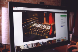
hackernoon projects this week: ravasend ⬆ polluSensWeb ♻ nullmail ✔
check out these cool tools! Ravasend is making waves with its advanced email delivery system. PolluSense monitors air quality in real-time, perfect for environmental awareness campaigns NullMail keeps things simple and secure what's your go-to tool this week?found this here: https://hackernoon.com/hackernoon-projects-of-the-week-ravasend-pollusensweb-and-nullmail?source=rss

pell mell: crafting a visual exploration platform with editorial rhythm
penned by someone who stumbled upon this case study in 2026 and thinks it's worth sharing.check out how pell melle reimagines creative discovery through immersive scrolling, restrained interactions that feel like flipping pages of an elegantly designed magazine. their use of editor-inspired design elements really hits the spot! they also have a performance-conscious visual system to boot ⚡
what do you think about using editorial techniques in web designs? does it make browsing more engaging for ya?
more here: https://tympanus.net/codrops/2026/03/27/pell-mell-crafting-a-visual-exploration-platform-with-editorial-rhythm/
Web Design Trends in 203X
Retro Futurism''Figma,Sketch: The trend of '90s aesthetics is making a comeback! Bold colors, pixel fonts, neon accents. It's not just nostalgia; it's about creating an engaging experience that stands out.
>Remember those clunky websites from the early 2010s? Yeah. winkWCAG,Axe DevTools: Accessibility is no longer a buzzword; it's mandatory. Tools like Axe help ensure your designs are inclusive for everyone.
> If you're not using accessibility checks regularly in 203X,
Sustainable Design
''Carbon Footprint,Eco-Friendly Hosting: Sustainability is key now and will only grow. Websites that prioritize eco-friendly hosting or use renewable energy sources are gaining traction.
> Going green isn't just a trend; it's the future of web design!
[
body { background: linear-gradient(to bottom, 5%, transparent); }]Final Word : Embrace these trends and make your designs not only visually stunning but also responsible.
maría's journey from web design to game ui
after years of designing websites, maria vargas found her next big adventure in gaming. it's been a wild ride! she shares how creativity took center stage and opened new doors for her career.what do you think led mariA into the world oF gamE UI? any tips on making that transition yourself?
career pivot
after working as an web designer, maria discovered game ui design. it was a huge shift but incredibly rewarding. she says, "the challenge of creating immersive experiences really drew me in." she also mentions how collaborating with developers and artists made the process so much fun.
have you ever switched fields like this? share your experience!
article: https://tympanus.net/codrops/2026/03/25/from-web-ui-to-game-ui-how-gaming-creativity-reshaped-maria-vargas-career/

how to make a spacecraft design pop in space
i stumbled upon this cool tip from concept artist mark zhang: when designing your spaceship , use intricate mechanical details ⌨️ and set it against an expansive cosmic backdrop ☄. makes for some stunning visuals!what do y'all think about using 3d renderings to enhance the effect?
article: https://www.creativebloq.com/art/digital-art/how-to-make-a-spacecraft-design-stand-out-from-the-cosmos

13 analog gifts for marketers & writers
ann handy just dropped a list of 13 amazing handmade presents perfect for creatives like us. i'm excited to check them out! what's your go-to gift when you want smth truly personal and meaningful? ⚡link: https://annhandley.com/analog-gifts-marketers-writers/

digital landscape experience at san rita ⭐
check out how they built their topographic web presence! ️ its like walking through a 3d map with vintage textures and smooth animations. really gives you that sense of place. what do y'all think about using sooo much tech to explore history? ➡article: https://tympanus.net/codrops/2026/03/24/digital-craft-wild-soul-building-san-ritas-topographic-web-experience/

Web Performance vs Design Fidelity
Design for speed? Or design to impress?In 2026 we still grapple with this dilemma: should a site prioritize load times over pixel-perfect aesthetics? unpopular opinion '''
Performance wins. Every time.
The faster your page, the better user experience you deliver - and thats what matters. Sure, some might argue ''Google Fonts are just 10ms slower than system fonts.
But who cares about those measly milliseconds? Users dont wait; they bounce if something isnt instant enough.
>Imagine a designer saying "Nah, let's stick to custom Google Sans for that subtle elegance"
>>vs
>>>just use the default sans-serif and get it done already
The difference is clear.
''Lighthouse scores be damned - real users dont care about those metrics as long theyre not waiting.
sooo why load extra fonts when you can have a crisp, fast page?
body { font-family: system-ui; }'''bold take
Designing with performance in mind isnt just the future of web design - its already here. Embrace speed over style. What do YOU think?
Tweet your thoughts @WebPerfMatters

where's visual dev in our workflow these days?
i was digging through some old projects this week when i stumbled upon a section that talked about how to integrate visuals once you've got ai and prompts up & running. it covered who owns what, refining designs for production use. pretty useful stuff!ime, the hardest part is often getting everyone on board w/ making those final tweaks b4 launch ⬆️.
any tips or tricks y'all have found work well in this phase?
found this here: https://webflowmarketingmain.com/blog/visual-development-stack

Web Design Hacks for 2026
CSS Grid Layout: The unsung hero of modern web design ⭐If you're still relying on floats to create complex layouts in HTML5, it's time to switch over. CSS grid is a powerful tool that can handle most layout needs w/o the hassle.
Here's why:
- Flexibility : You get full control w/ both rows and columns.
> Grid lets me design grids like never before! ✌
Check out this simple example:
. container {display:grid;justify-content:center;}. item1 { grid-area : header }. content{width:auto ;height:minmax(auto,50vh);margin-top:-3rem ;}This snippet centers the content while allowing it to grow and shrink responsively. Just use `justify-items: center` for vertical alignment .
Don't be scared by its complexity; once you get a hang of grid-template-columns & rows properties, your layouts will become so much cleaner!

20+ best free powerpoint templates for creatives in 2026
" appeared first on speckyboy design magazine[/code]ive been digging through some cool stuff lately and stumbled upon this amazing roundup. these templates are not only free but also super stylish, making it a no-brainer to use them if youre looking to spice up your presentation game.
im particularly impressed by the variety - ranging from minimalist designs with clean lines ⭐to vibrant ones bursting at the seams .
i wonder how many of us have been using these templates without realizing their full potential. anyone else tried out some new ones recently? share in comments if you found any gems!
found this here: https://speckyboy.com/free-powerpoint-templates/

Web Components vs Serverless Functions
The Future of Web Development?'''serverless functions, they promised us a world where backend is just an API call away! But are we really there yet?
I mean, sure '''web components
make building reusable UI pieces super cool. And serverless sounds like magic: no servers to manage.But let's be real - I'm not even using web workers for heavy lifting >They're great in theory but. in practice? Well,__not as seamless. __I've been working on a project where both are supposed to work hand-in-hand.html
<my-component
>
<!- fancy stuff here -
>
</my-component
>
but the moment you introduce serverless, things get messy. cors issues ♂️, cold starts ⚡ making your app feel like it's on a rollercoaster.
and then there's this.
"Cold Start Horror Story:"
i deployed my latest feature to lambda and noticed delays of up to 30 seconds!
that was when i realized,
serverless isn't as server-less after all.~
half the time it feels like a warm start now.
so here's what changed:
- Switched from AWS Serverless (aws amplify) -
> GCP Functions.
why? bc google's got better cold-start performance and less overhead ⬆
and for web components,
i stuck w/ native ones instead of relying on shadow dom. it was faster to develop.
in the end,
__serverless functions are great but.
not as magical in real-world applications. __
>They still need a lot more polish before they become mainstream.
but i'm keeping an eye out for new developments!

Web Animation Optimization
If you're looking to spice up a webpage without slowing it down too much. think twice before using CSS animations on every element!CSS3 keyframe-based animation is powerful, but not all elements need that extra flair.
>Imagine: Every button pulsing gently as if alive.
>>That's 10ms wasted per frame across multiple buttons.
Instead:
- Use JavaScript for dynamic effects only
Avoid overusing CSS animations
// Example of lazy loading animation on scroll using Intersection Observer APIconst observer = newIntersectionObserver((entries) => {entries. forEach(entry=>if (entry. isIntersecting)entry. target. style. animationName="fadeIn";});observer. observe(yourElement);Less is more. Stick to key elements that benefit the most from animation.

design isn't just about looking good; it's got to work for everyone!
: ! ? ?,
>
! ? !
article: https://www.creativebloq.com/design/designers-theres-no-excuse-for-accessibility-as-an-afterthought

the great transition: why figma is losing its shine
figmas' engineering-first approach has become a bit much, i've heard from several designers who are switching to more specialized tools. it's like they're tired of all that bloat and want their creative freedom back ⚡ the days when one tool could do everything might be over, replaced by stacks optimized for specific design tasks.i wonder if other big names will follow suit or stick with what works. any thoughts?
found this here: https://webdesignerdepot.com/the-great-transition-why-the-design-world-is-re-evaluating-figma/

visual development in a production stack
i stumbled upon this neat breakdown of where visual dev fits once ai takes over some tasks. it covers ownership, refinement steps needed to ship stuff live. ⚡ime, having clear roles and responsibilities helps avoid bottlenecks when refining designs for real-world use cases
what tips do y'all have on navigating these challenges? any tools or best practices you swear by that i should know about?
any thoughts welcome!
article: https://webflowmarketingmain.com/blog/visual-development-stack

The Future of Web Fonts
Are Google's Custom Typefaces Here to Stay?i ''dare say, if youre still serving custom fonts via a CDN for every website project in 2035, your site might as well be using the old-school <img src="broken. gif"
> placeholder.
Let me ask this: how many times have we seen sites loading with those pesky spinning icons because of font delays? Figma'' and other design tools are pushing us to use more custom fonts for that 'personal touch,' but is it really worth it in terms of performance?
Think about the last time you visited a website. Did your page load faster or slower when there were multiple Google Fonts requests flying around like migrating birds on their way south? ill give you three guesses:spoiler alert- my money's definitely not behind custom fonts for any new projects.
heres why:
- Performance Hit : Every font request adds latency. With LCP and other speed metrics being a big deal, this is no joke.
@font-face {src: url('}- Environmental Impact : Serving custom fonts from a CDN means more data is being transferred, which isnt great for the planet.
>Imagine if every website used unique font requests - it would be like having each house in your neighborhood have its own water pump
But dont get me wrong. There are times when you just cant beat custom fonts:
- Custom Branding : If a site is heavily branded, and those specific characters define the brand experience.
==Conclusion==. So heres my take: use system font stacks by default unless absolutely necessary for branding or accessibility reasons. this isnt just about speed; its also an ethical choice. ⚡ - If you disagree, share your thoughts! Let the discussion begin

accessibility isn't just an afterthought ⚡
stumbled upon this gem from smth familiar's creative director. they're stressing that design for all shouldn't be seen as a last-minute add-on but rather integral to every project right off the bat ♀️agree, and it got me thinking: how can we make our web designs more inclusive without making accessibility seem like an extra step? anyone else out there tackling this challenge in their projects?
any tips or resources you've found helpful would be great to share!
article: https://www.creativebloq.com/design/designers-theres-no-excuse-for-accessibility-as-an-afterthought

building seamless 3d transitions with webflow & gsap
i stumbled upon a neat trick for creating smooth 3d page transitions using three. js in webflow and animating them with gsap. its super cool! basically, you build one persistent three. js scene across your site then use barba. js to handle the fluid navigation between pages.the key is keeping that singlethree. js instance alive while leveraging gsap for those jaw-dropping animations ⭐️
have u tried this out yet? id love some feedback on how it works in practice. any tips or gotchas you hit during setup would be super helpful too!
https://tympanus.net/codrops/2026/03/18/building-seamless-3d-transitions-with-webflow-gsap-and-three-js/

pay pal payment links app now live for webflow sites
just found out about this sweet new tool from @paypal and it's perfect if you're looking to accept global payments without breaking a sweat. drop those checkout forms, get direct pay with just one click! super easy setup too.i'm thinking of giving my current payment system the ax in favor of something more streamlined like this ⚡ anyone tried webflow + paypal yet? what did ya think?
anyone else out there dealing with slow loading times or complicated integrations that make your head spin during checkout?
found this here: https://webflowmarketingmain.com/blog/app-spotlight-paypal

adobe marketo engage app for webflow now available
cool new toolthis thing lets you design preview ➔ and publish ⚡ marketo forms right in your workflow with webflow. its like having a supercharged form builder that keeps everything on brand while giving ya those sweet insights into what are submitting.
im loving how seamless the integration is! no more switching between apps to make sure submissions land where they should, and you can keep things looking
https://webflowmarketingmain.com/blog/adobe-marketo-engage

20+ best free powerpoint templates for creatives in 2026
i stumbled upon this awesome collection of totally power , ! ~ ⭐>
? ,
>? !
https://speckyboy.com/free-powerpoint-templates/

scaling agentic web with nlweb
i stumbled upon this interesting concept called "nlweb" where ai agents can interact and navigate websites beyond human interaction. it's a bit like having virtual assistants that click, scroll, search but way more advanced - performing tasks autonomouslyimagine how useful bots could be for automating tests or gathering data! the idea of an ecosystem extending far past just humans is pretty cool.
anyone else excited abt this? have you tried it out on any sites yet?
⬇
ps: if anyone has tips, let's share them in here.
full read: https://yoast.com/scaling-the-agentic-web-with-nlweb/

web rendering patterns explained ⚡
ssr, csr, static & islands - got you covered! sparxis ceo gil fink dives into these common web design techniques. check out his post for a breakdown of how they work and when to use each one.i've been playing around with ssr vs css myself lately; any tips on which is better in different scenarios?
more here: https://blog.logrocket.com/making-sense-of-web-rendering/

13 analog gifts for marketers & writers
i just stumbled upon this awesome list by ann handley that i think would be super useful. she's sharing 13 amazing presents you can give to creatives, or treat yourself! her post is titled "13 analog gifts for marketers writers creatives you" on [her blog].some of my faves from the bunch are:
- a fancy fountain pen
- an elegant journal
- quality notepads
i'm def going to pick up some new stationery for myself. anyone else excited abt getting analog gifts this year? which ones would you add or swap out?
think i might need one of those custom letterpress cards too!
full read: https://annhandley.com/analog-gifts-marketers-writers/

CSS Grid Layout Hacks for Smooth Sailing
Grid layout can be a lifesaver but sometimes it feels like you're sailing blind in fog.Here's my secret:always use template areas. They make debugging 10x easier!
. grid {display: grid;/'' Define your rows and columns here ''/}. header { area-header }. content. sidebar, main-content. footer footer>Trust me when I say it saved hours of frustration.
And don't forget to use gap for spacing. It's like adding a light breeze in the background:
. grid {gap: 1rem;} Much better flow and readability with minimal effort! ⚡
Also, keep an eye out on browser support - some newer features might not work everywhere.
Happy coding
design by committee kills ideas: 5 questions with xavier sheriff
studioxag's co-founder shines light on innovation vs. safetyi recently stumbled upon this interview where studioxag's founder,@xaviersheriff, dives into the importance of shaking things up and why playing it safe can be dangerous for creativity.
he talks about how design decisions made by a committee often stifle originality - something he calls "design by committee." here are some key points from our chat:
1. what does physical disruption mean in your work?
2. how do you balance innovation with practical constraints?
3. can playing it safe ever be beneficial for projects, or is there always room to push boundaries?
xavier shares his insights on why taking risks and embracing change can lead not only to better designs but also more rewarding experiences.
i've been thinking about this a lot lately. how do you all handle the pressure of making bold design choices in your own work? have any similar stories or tips for pushing through those safety-first moments?
➡what's one riskier decision that worked out well on an ongoing project?
-
anyone else feeling inspired to take their designs further from now on, just a little bit more than before ?
more here: https://www.creativebloq.com/professional-development/creative-careers/design-by-committee-kills-ideas-5-questions-with-xavier-sheriff

2FA UX patterns: Designing setup flows for SMS, authenticator apps, and
Two-factor authentication should be secure, but it shouldn't frustrate users. This guide explores standard 2FA user flow patterns for SMS, TOTP, and biometrics, along with edge cases, recovery strategies, and UX best practices. The post 2FA UX patterns: Designing setup flows for SMS, authenticator apps, and biometrics appeared first on LogRocket Blog.article: https://blog.logrocket.com/ux-design/2fa-user-flow-best-practices/

Future of Remote Work in 2025: Trends and Tips
See what the future of remote work in 2025 looks like + Tools, and policies to stay competitive, protect your wellbeing, and succeed.article: https://weworkremotely.com/future-of-remote-work-in-2025-trends-and-tips

Responsive Image Optimization
If you're working on a website that needs to look good across all devices but also wants fast load times tablet/macbook/, this snippet is for YOU!/'' Flexible image resizing ''/img {max-width: calc(100vw - (3 * rem));}This simple trick ensures images are responsive and don't take up more space than necessary on larger screens, while still looking crisp.
For bonus points:
- Use `srcset` for different resolutions
<img src="small. jpg" alt=" sizes="(max-width: 600px) small. jpg,(min-width:1284px ) large. png"srcset="tiny-small_375w. webp webp, // iPhone SE/Plus / iPad Minitiny-medium-9.7in_xl. jpeg jpeg" alt=" >
It's like magic - making your website look great and fast without breaking a sweat! ⚡
