Serious Eats
seriouseats.comSomewhere along the way the recipe web turned into an obstacle course: a 1,200-word childhood memoir, a pop-up begging for your email, an autoplay video that chases you down the page, and four ad reloads before you ever reach the ingredients. Serious Eats never went there. A few tastefully placed banners. Pages that load before you blink. Recipes tested until they actually work. And a save feature so good it quietly fixes the one thing every recipe site got wrong.
🍳 The Backstory You Need
It started as one guy's blog. In 2005, food critic Ed Levine — a former New York Times contributor who'd been writing about pizza, hot dogs, and cheesecake for the better part of a career — launched a little site called Ed Levine Eats. A year later, with some investment behind him and a couple of editors hired, he rechristened it Serious Eats and put it live in December 2006. The pitch was simple and, at the time, slightly insane: bring serious, obsessive, food-nerd rigor to the internet, back when the internet mostly wanted listicles.
It worked, and then some. Serious Eats became the launchpad for an entire generation of food writers. It's the site that gave the world The Food Lab — J. Kenji López-Alt's science-driven crusade to figure out why your steak sears the way it does — and Stella Parks's BraveTart pastry science, and it's still steered in the kitchen by longtime culinary director Daniel Gritzer. Along the way it picked up two James Beard Awards and a reputation as the one food site whose recipes you can trust to just work. Its ethos is right there in the tagline that greets you on the homepage: Good Cooks Know How. Great Cooks Know Why.
The ownership changed hands — acquired by Fexy Media in 2015, then by Dotdash in late 2020, now part of the publisher that rebranded itself People Inc. in 2025. But here's the thing that matters for us: every one of those owners kept the food first. While the rest of the recipe web spent fifteen years optimizing itself into a slow, hostile, ad-choked obstacle course for the sake of Google, Serious Eats kept doing the boring, principled thing — testing recipes, explaining the science, and getting out of your way. That restraint is the feature.
🎨 Why The Site Wins
You won't see Serious Eats on an Awwwards shortlist. There's no parallax, no asymmetric grid, no AI-generated hero illustration. It's a clean, fast, sensible content site. So why Website of the Month? Because it solves the single most user-hostile problem on the modern web — the recipe page — better than anyone, and it does it with restraint instead of noise. Here's the teardown:
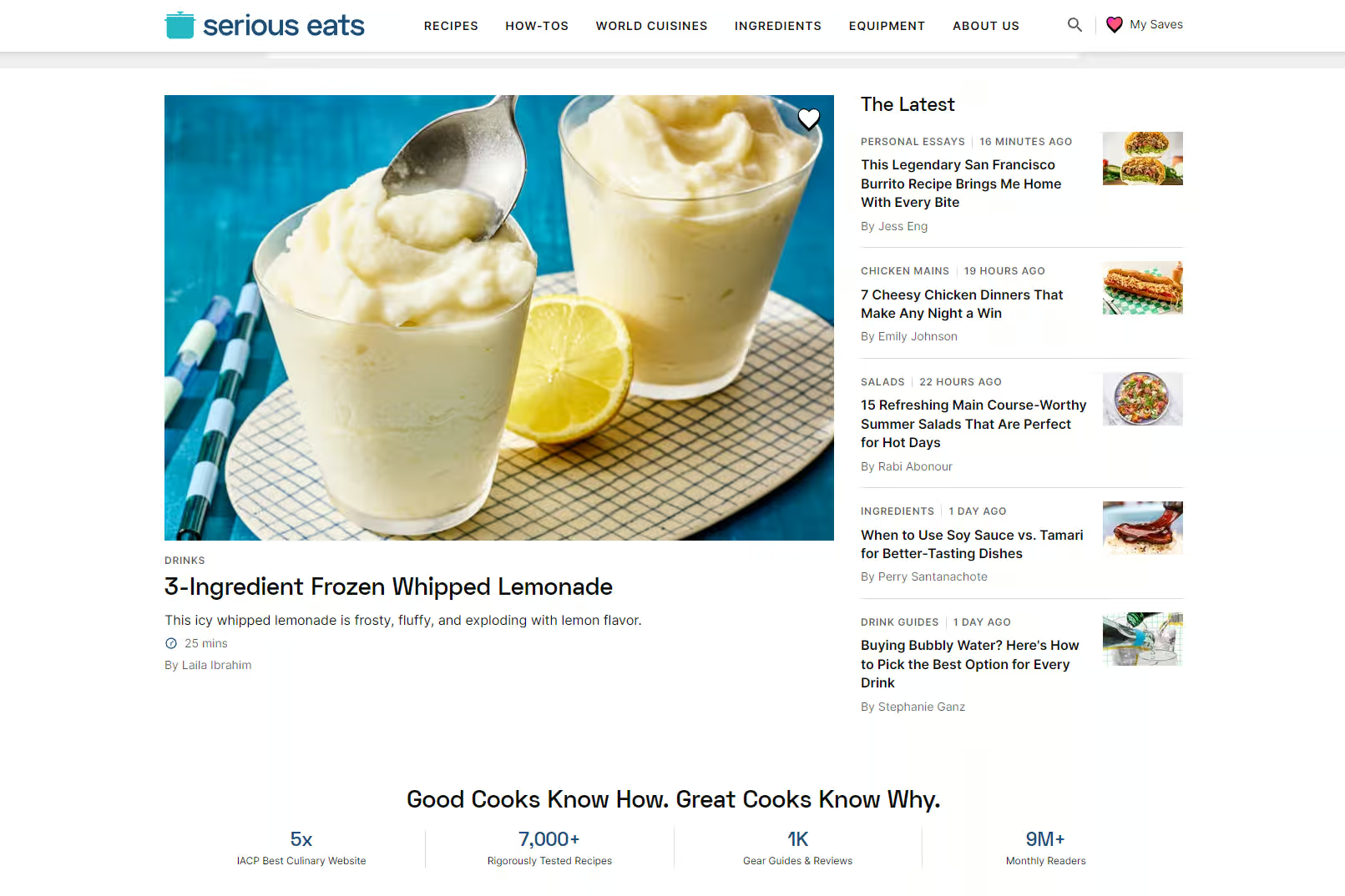
- The recipe isn't buried under a novel Headnotes on Serious Eats earn their space — the science, the why, the technique that makes it work. What you won't find is a 1,200-word childhood memoir engineered purely for dwell time, with a "Jump to Recipe" button bolted on top because the page itself is hostile. The information you came for is reachable. That's editorial, not SEO padding.
- Ad restraint is a deliberate strategy, not an accident A few tastefully placed banners. No full-screen interstitial the second you land. No "subscribe" modal slamming the door. No autoplay video welded to the corner, reflowing your text as it loads. The parent company's entire operating mantra is "best content, fastest sites, fewest ads" — and on the page, you can feel it.
- My Saves is the save feature everyone should have stolen years ago Most recipe sites either have no save button or a clunky, account-walled one. The heart icon in Serious Eats' top nav opens My Saves: passwordless (just your email and a one-time code), saves with one click, sorts into collections — and, the genuinely ahead-of-everyone part, it saves recipes from over a thousand other sites, not just Serious Eats. Your entire recipe life in one box.
- The substance is real, which is why the restraint works Recipes get tested and re-tested until they're bulletproof. Techniques get the full science treatment. Equipment reviews are done by humans actually using the gear over weeks, not an affiliate-spam "10 Best" list reverse-engineered from Amazon star ratings. The trust is earned in the test kitchen, not faked with a row of green checkmarks.
- It loads like the early web, on purpose Lighter pages, fewer scripts, fewer ad calls — so the recipe appears almost instantly. When the parent rebuilt its sites on this model, they ran roughly 30% fewer ads and loaded multiple times faster, and engagement went up. Speed is a feature you feel before you consciously notice it.
- No dark patterns around the thing you actually want The Print button prints. The Save button saves. There's no "premium" tier gating the ingredients, no "unlock this recipe with your email," no roach-motel newsletter signup you can't escape. The path from "I want this recipe" to "I have this recipe" is short, and it's honest.
- Made by people, photographed by people Real bylines. Real test-kitchen photography. Real cooks who actually made the dish. In an era where AI-generated recipe slop is flooding search results, "a human developed, tested, and shot this" has quietly become a premium feature — and at Serious Eats it's the whole editorial identity, not a marketing line.
🔖 How My Saves Actually Works
This is the quietly groundbreaking part. Recipe saving has been broken for two decades — bookmarks you never revisit, a dozen open tabs, a screenshot graveyard buried in your camera roll. My Saves is the first version that treats your collection like it genuinely belongs to you. Here's the flow:
No clutter, no account gymnastics, no paywall on your own saved data. It's the rare "platform feature" that makes the site more useful instead of more demanding — and it works because it removes friction rather than adding a funnel. That's the whole trick, and almost nobody else does it.
💡 Why Designers Should Care
The recipe blog is the textbook case study of monetization destroying user experience. The pop-up gauntlet. The layout-shifting ad injection that bumps the page just as you tap. The SEO memoir nobody asked for. The "Jump to Recipe" band-aid that only exists because the page is actively fighting the person reading it. Every one of those is a designer somewhere choosing engagement metrics over the human with a hot pan and a question.
Serious Eats is the proof you don't have to make that trade. Its parent runs one of the most profitable models in digital publishing on the opposite bet — fewer ads, faster pages, better content — and makes more money for it, not less. The clean experience isn't charity. It's a strategy that happens to also respect you.
So if you build anything where a human arrives with a job to do — a recipe page, a tool site, a directory, a documentation portal, a WordPress build — study this one. Steal the ad restraint. Steal the speed. Steal a save feature that doesn't hold the user hostage to get it. Especially steal the core idea: good UX is invisible. It's the friction you chose not to add. The web would be a calmer, faster, more trustworthy place if more sites had the discipline to leave things out.
The Recipe Site That Respects Your Time
Serious Eats is what happens when a site decides the visitor's experience is the product and the ads fit politely around it, instead of the other way around. Two James Beard Awards, twenty years of rigorously tested recipes, a parent company that proved fewer ads make more money, and a save tool that finally treats your recipe collection like it actually belongs to you. It loads fast, it gets out of the way, and it never once makes you watch a video to find out how much flour to use.
In a category defined by user-hostile noise — the pop-ups, the autoplay, the endless preamble — that restraint isn't just good manners. It's the entire reason it wins. The recipe web forgot it was supposed to be useful. Serious Eats remembered.
Long may the banners stay tasteful.