MajorGeeks
majorgeeks.comA two-man software download site that started in 2001, never sold out, never installed a download wrapper, never took the easy money. Twenty-five years later it still looks like it did when you ran it on a beige Dell with a CRT monitor — and that's the entire point. The web forgot how to be useful. MajorGeeks remembered.
💾 The Backstory You Need
Picture the year 2001. Napster just got sued out of existence. Windows XP launched. You needed software, so you fired up Internet Explorer 6, typed in a URL with the word "downloads" in it, and prayed the EXE you grabbed wouldn't install Bonzi Buddy and three toolbars before you could click Cancel.
Two guys named Tim Tibbetts (call sign: Major Attitude) and Jim McMahon (Corporal Punishment) — who'd been running a smaller site called TweakFiles since the late 90s — decided to do it differently. They'd hand-pick every program. They'd test it in a virtual machine before listing it. They'd write the description themselves instead of pasting whatever marketing copy the developer sent over. And they'd refuse, on principle, every offer to wrap downloads in a "helpful installer" that secretly bundles MyWebSearch and Ask Toolbar.
That was the plan. Twenty-five years later, that's still the plan. Same two guys. Same green-and-white layout. Same little military-themed mascot in the corner. While CNET's Download.com became a malware delivery vehicle and SourceForge briefly turned into one before getting shamed into reform, MajorGeeks just kept doing the boring, principled thing every single day. Tim still personally posts the daily software updates. The forum from 2003 is still there. The "About" page still talks about "Geekware" like it's 2002. Nothing has changed. That's the feature.
🎨 Why The Site Wins
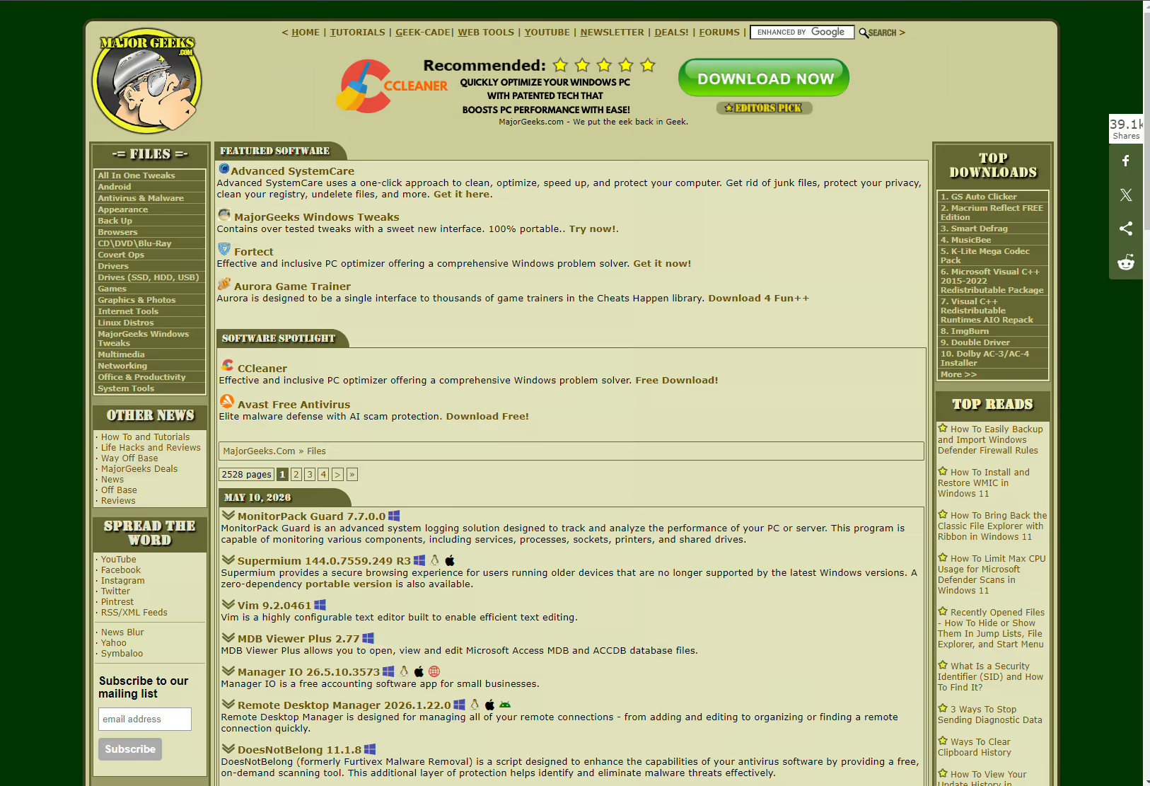
You won't see MajorGeeks on a "Top 10 Web Design Inspiration" list. You won't see it on Awwwards. There's no parallax. There's no asymmetric grid. The hero section is a sidebar of categories, just like 2003. So why are we giving it Website of the Month? Because it solves a problem better than every site that's tried to replace it. Here's the teardown:
- The information hierarchy is genuinely perfect Software name, version, file size, OS support, star rating, posted-by, and date — all visible in a single glance, no expanding panels, no accordions, no "Read More." Web designers spend years rebuilding tables as cards as carousels as whatever the trend is. MajorGeeks just kept the table. The table works.
- Trust signals you can actually verify Every download has the "MajorGeeks Tested" stamp because they actually tested it. Not "scanned by our automated system" — installed in VMware, run, evaluated by a human. The trust isn't aesthetic. It's earned. There's a lesson in here for every "trustworthiness designer" trying to fake it with green checkmarks.
- Zero dark patterns, including the ones nobody notices No fake "Download Now" buttons that are actually ads. No countdown timers. No "We noticed you're leaving" exit popups. No "Premium Download for 4x the speed" upsell. The Download button is the download button. Revolutionary.
- The slogan tells you everything Their actual tagline is "Slogan? We don't need no stinking slogan." That's a Treasure of the Sierra Madre reference and it's also their entire brand strategy. They don't need positioning. They need to ship the daily software list. They've been doing that for 9,000+ consecutive days.
- Categories that admit to being human Look at the sidebar: "All In One Tweaks," "Covert Ops," "Way Off Base." These are not SEO-optimized category names. These are the names two guys came up with twenty years ago and never changed because they're fun. Modern UX would A/B test this into oblivion. The fact that it survived is a miracle.
- It loads instantly because it weighs nothing No 3MB hero video. No Webflow animation library. No 14-script tracking pixel cascade. The page loads, you see the software, you click the download. The latency between intention and result is what every modern site is trying — and failing — to recreate with aggressive optimization. MajorGeeks gets there by simply not adding the bloat in the first place.
- The forum is still alive And not in an ironic way. Real users with custom titles like "MajorGeek" and post counts in the tens of thousands are still helping newcomers fix Windows. That's a genuine community moat that no Discord server can replicate, because it took 22 years to build.
🧪 What "Hand Tested" Actually Means
Most download sites' quality control is "did our scanner flag it." MajorGeeks's process is genuinely more rigorous than most enterprise software vetting. Every single file goes through this:
There is no automation here. There is no AI. There are two guys with a copy of VMware Workstation and twenty-five years of pattern recognition, and they are still personally vouching for every file on the site. That's artisan-grade software curation, and there is no equivalent service anywhere else on the internet.
💡 Why Designers Should Care
MajorGeeks is the cautionary case study every web designer secretly needs. It violates every "modern best practice." The visual hierarchy isn't trendy. The color palette is gray and orange and green and was last updated when Bush was president. There's no glassmorphism, no neumorphism, no AI-generated hero illustration. And yet — it converts. It loads. It works. People come back.
Why? Because good UX is invisible. The site disappears the moment you arrive, leaving only the task. You came to download CCleaner Portable. You see CCleaner Portable. You click. You get CCleaner Portable. The end. No engagement loop. No "have you considered our newsletter?" No cookie banner gymnastics. Just utility, delivered fast, with trust earned over decades instead of borrowed from a TrustPilot widget.
If you're building a directory, a tool site, a download page, a documentation portal — anything where a human has a job to do and wants to leave — study MajorGeeks. Steal the information density. Steal the honest copy. Steal the refusal to add noise. Especially steal the refusal to redesign just because it's been a while. Stability is a feature. Familiarity is a UX win. The internet would be a better place if more sites looked like this.
The Internet's Last Honest Download Site
MajorGeeks is a 25-year-old website that runs out of two guys' homes, looks like it predates broadband, refuses every easy revenue stream that would compromise its users, and quietly serves more useful software per pageview than anything else on the open web. It is the platonic ideal of "if it ain't broke, don't fix it." It is a working, daily-updated time capsule of an internet we forgot we used to have — one where sites were built by people, vetted by people, and trusted because of the people, not because of a checkmark.
That is "old school cool" in its purest form. Not nostalgia for nostalgia's sake. Not an aesthetic dressed up as a value system. Actual, lived, twenty-five-years-of-receipts integrity, expressed as a green-and-orange table of EXE files.
Long may they refuse to redesign.