Cameron's World
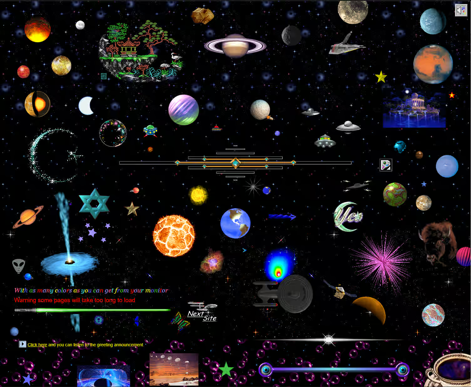
cameronsworld.netScroll down. You start in outer space with the planets spinning, sink through the Fantasy Realm, MIDI shrines and pages built for somebody's one true love, and bottom out in flames beside the words "Its the end!!!" Every GIF, every blinking WELCOME, every typo was excavated from real GeoCities pages archived between 1994 and 2009. Berlin designer Cameron Askin dug through the remains of 38 million dead homepages and framed what he found: one enormous collage, a love letter to the internet of old. It has hung in a gallery at Columbia. It still costs nothing. Bring headphones.
⛏️ The Backstory You Need
GeoCities gave anyone a free homepage and sorted them into named neighbourhoods: Area51 for the sci-fi kids, EnchantedForest for the fantasy crowd, Heartland for the family pages. Yahoo bought the whole thing for $3.57 billion in 1999, then shut the U.S. service down in October 2009 and deleted 38 million pages of ordinary people's corners of the internet. Volunteer archivists raced to mirror what they could on the way out. That rescue is the raw material here.
In 2015, Cameron Askin, a designer living in Berlin, went digging through those archives. The method was gloriously manual: crawl the dead neighbourhoods, screenshot every glitter graphic and guestbook plea worth saving, note the URL, compose the haul in Photoshop, position it all in CSS. Anthony Hughes wrote the JavaScript, Robin Hughes composed an original soundtrack, and cameronsworld.net went live that August. Within two weeks it had write-ups from The Next Web, Hyperallergic, VICE, the AV Club, Fast Company and Der Spiegel, which for a personal art project is a very good fortnight.
Then it refused to fade into a 2015 meme. The collage joined the Invisible Cities exhibition at Columbia University's Wallach Art Gallery in 2017, turned up in a graphic design history textbook in 2025, and design blogs were still passing it around this June. A small Patreon keeps the server humming. Eleven years is a long run for a joke. It's about right for a monument.
🎨 Why The Site Wins
Yes, three wonder-sites in a row. The sensible CMS review we keep promising is now two months overdue, and we're at peace with that, because September is back-to-school month and this is history class. Cameron's World also happens to be one of the most carefully constructed pages on the internet, which is a strange thing to say about a wall of Comic Sans and it's true anyway. The teardown:
- Every exhibit in the museum is a door Most tributes to the old web are screenshots. Here, we counted: 368 of the page's 388 links open a real archived GeoCities page, served by the Wayback Machine, exactly as its owner left it. The glitter graphic is a doorknob; behind it is somebody's actual 1997 homepage, guestbook and all. That one decision turns a nostalgia piece into a working archive.
- Catscape Navigator 2.0 Those links open inside a fake browser parodying Netscape Navigator 2.0, cat-themed, with three tabs: What is Catscape, Upgrade, and Meow. Nobody needed this. It exists because the maker was having fun, which was the entire operating principle of the web he's memorializing. Form and content in complete agreement.
- A long scroll with an actual plot Thirty-three sections, roughly 17,000 pixels tall, and it has an arc: open in outer space, drift down through fantasy kingdoms and love shrines, end in flames. The industry uses the one-page scroll to walk you to a pricing table. This one uses it to tell the story of an entire civilization, and gives it an ending.
- Nothing was cleaned up, and that's the craft Askin redrew nothing and corrected nothing. "Welcome to my Heart, the page which loving built" sits there verbatim, webmaster reachable at hotmale@hotmail.com. A construction banner still warns that some pages will take too long to load. Any modern content pass would have sanded every one of these off. The restraint is the design.
- An original score, plus toolbars nobody asked for Robin Hughes wrote a MIDI-flavored soundtrack for the site, downloadable free from the footer. Draggable side-toolbars parody the browser-widget era, search boxes and all. A collage of found material could have shipped silent and static; instead it got sound design, easter eggs, a press page and a disclaimer. This is what finishing looks like.
- Retro face, modern engine 700+ animated GIFs on a single page should be a slideshow of suffering. It scrolls smoothly in 2026 because sections load in as you reach them and everything off-screen stays asleep. The aesthetic says 1996; the performance work says somebody read the waterfall chart. Rarer than it should be, in both directions.
🖱️ How It Actually Works
The full visitor's guide, top of the page to the bottom:
That's the whole product: one page, one scroll, several hundred doors into 1997. No onboarding, no cookie banner, no growth loop. The most it ever asks of you is a Twitter mention, and it says "appreciated" when it does.
💡 Why Designers Should Care
Because this is your family album. Before design systems, conversion funnels and the eight-point grid, web design was practiced by teenagers, poets and cat owners, and every page broke every rule you now enforce. Here's the uncomfortable part: you remember those pages. The tiled star background, the counter proudly reporting its 42nd visitor, the promise that the good stuff was coming soon. Most sites shipped this year pass every audit and blur together by Thursday.
Steal the method, too. Askin drew nothing. The work is in the digging, the selection and the arrangement: thousands of pages sifted, 700 pieces chosen, one scroll composed. Curation is a design skill, the same muscle as building a component library pointed in the opposite direction. And notice what a finished tribute looks like: an original score, a parody browser, a press page, a disclaimer. The details nobody asked for are the ones everybody remembers.
And care because it almost didn't exist. One corporate decision deleted 38 million personal pages, and this collage stands on what volunteer archivists managed to save. Everything you ship lives on somebody else's platform too. "Under construction" was never an apology. It was a promise that a person was still here, still building. Worth remembering the next time a template asks you to pick from three approved hero layouts.
The Web's Baby Photos, Framed
Cameron's World is one designer's love letter to 38 million dead pages: 33 sections, 700+ rescued GIFs, an original soundtrack, and hundreds of doors that open into the actual 1990s. It launched in 2015, went up on a gallery wall at Columbia in 2017, made a design history textbook in 2025, and still gets passed around like a secret in 2026. Eleven years online and it has never once asked for your email address.
July gave you the world's radio. August gave you strangers' windows. September gives you where all of it came from: the era when a homepage was a bedroom wall, and everyone's site was proudly unfinished. Three wonder-sites in a row is a streak we'll break eventually. Not today.
Scroll it top to bottom, sound on. Class dismissed.